Platform UI Libraries
Our Product Design teams were consistently arriving to design reviews with UI that couldn’t be built as designed. Designers felt discouraged, PMs were artificially impressed by visuals, and developers were left trying to “get close” without a clear path to implementation. This disconnect was largely the result of a major tooling transition, our design org had shifted from Sketch to Figma just as the React-based Canvas Design System kit was being introduced, creating a gap between what was being designed and what could realistically be developed.
Overview
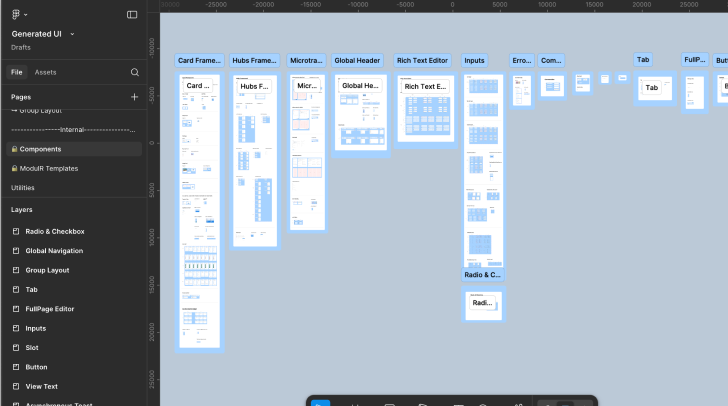
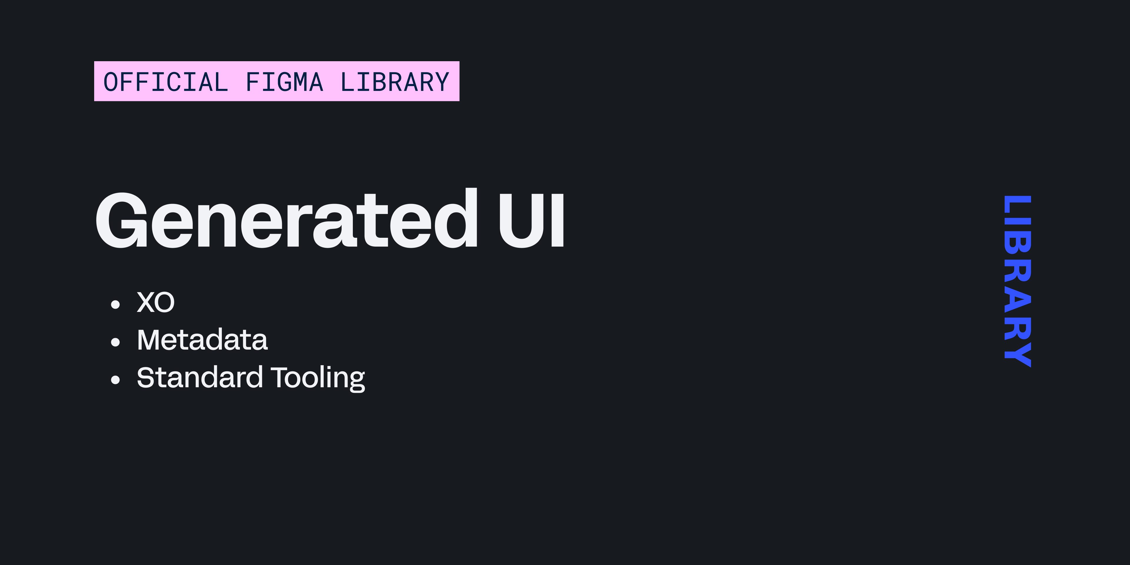
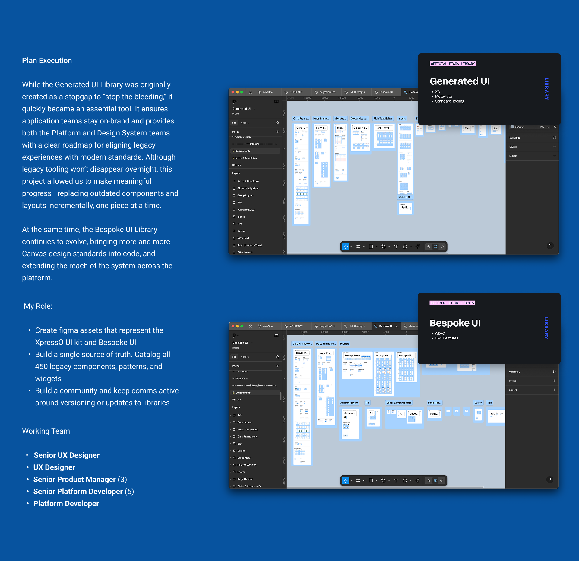
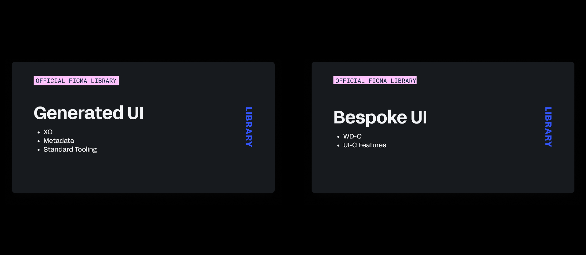
While documentation and planning were kicked off by my PM partner and me, a design peer joined the effort and helped merge individual components that could be directly translated from the Canvas kit. Together, we assembled two complementary libraries: a Generated UI Library for legacy tooling only, and a Bespoke UI Library for platform-supported components built on our design system. These lived across three dedicated Figma repositories that intentionally mirrored the corresponding development repositories. This structure removed ambiguity for design and engineering and eliminated the need for teams to approximate or reinterpret design mocks during build.
Impact at a Glance
Process
Problem
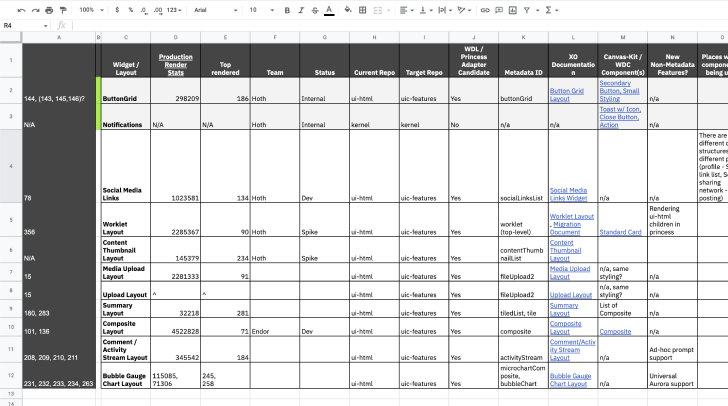
Legacy design teams often pulled patterns and assets from the React-based Figma toolkit without realizing the downstream impact. This led to inconsistencies, friction, and unnecessary code sprawl across the product suite. Engineering frequently had to “get close” to design mocks just to keep work moving, especially since no legacy-compatible toolkits were available at the time.
- A swap from Sketch to Figma had been well received internally but the older XpressO toolkits had been abandoned during this transition period
- Product Designers had been showing up to reviews with their PM’s and Developers with designs, flows, and assets that were not buildable
- An unclear understanding of how Core platform tooling works in relation to our Design System. How enhancements get funded or how to present contributions
- Which UI kit to use based on the development team I’m working with
Approach
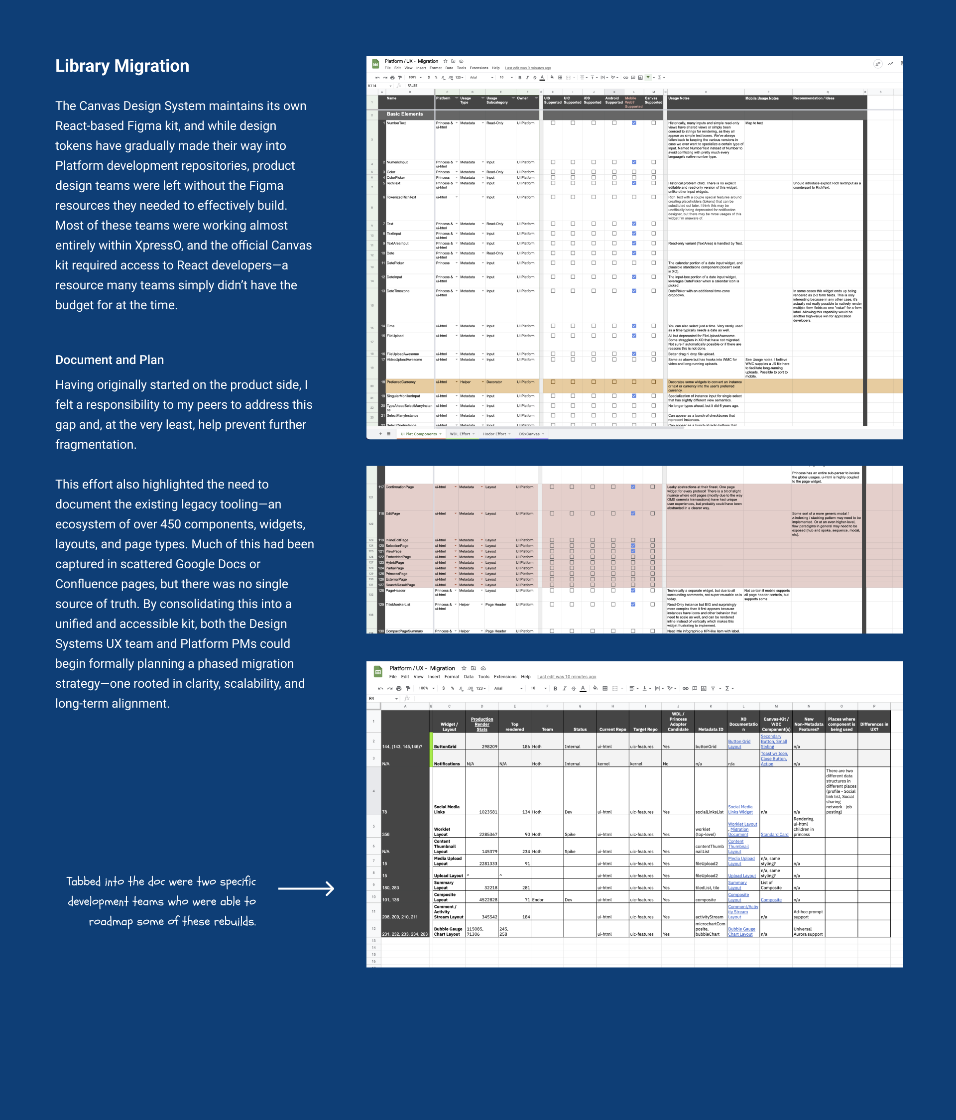
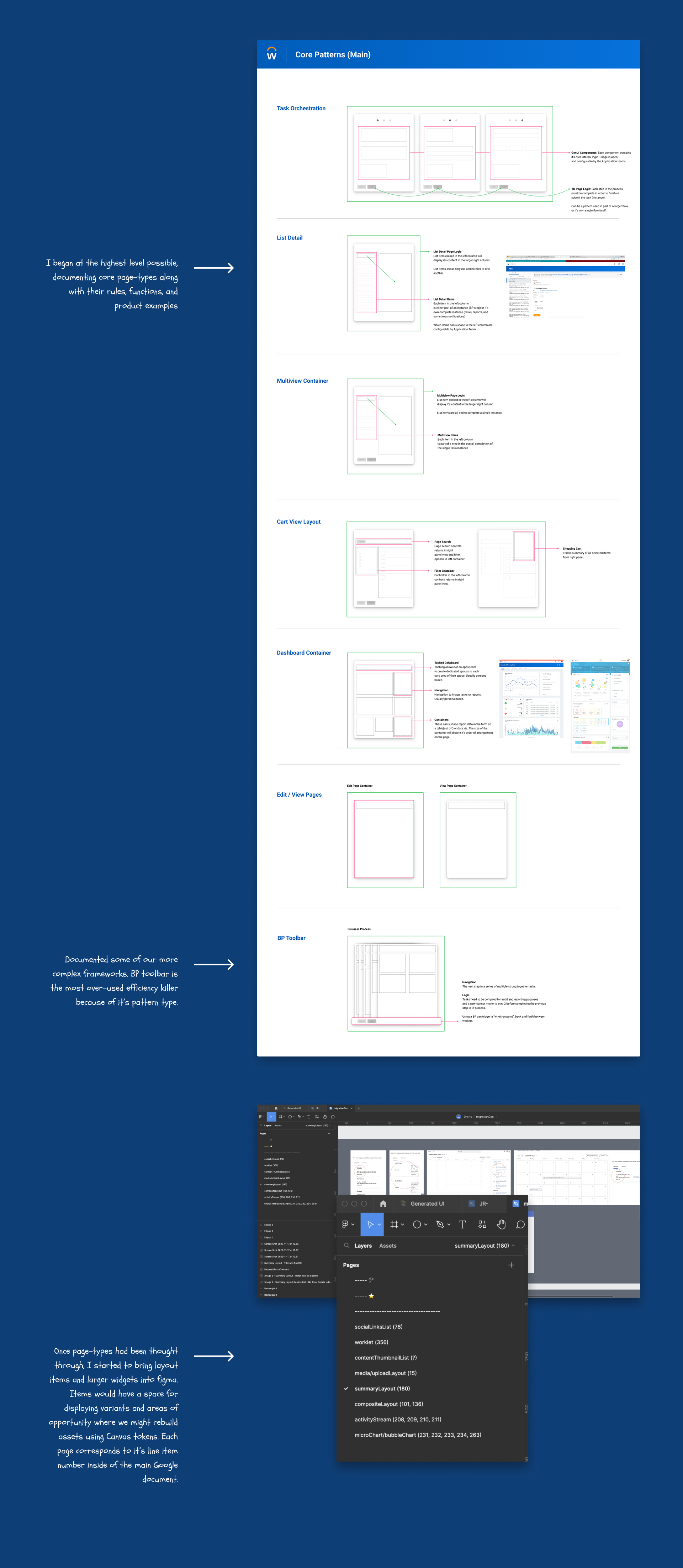
I addressed this by auditing legacy implementations across repositories and creating a single source of truth that consolidated Confluence pages, Google Docs, and custom site documentation. I then cross-referenced these findings against Canvas-based elements so the team could align on which areas were best suited for rebuilds or migrations. This work ran in parallel with creating two separate Figma toolkits for legacy designers. One toolkit supported patterns that remained backed by legacy tooling, while the other was backed and maintained by the design system. All of this was supported with practical documentation, decision trees, and real-world examples to guide consistent adoption.
- Audit legacy prompt implementations across repos
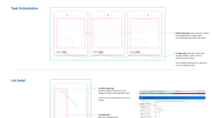
- Define atomic → compound variant taxonomy
- Tokenize interaction + visual states
- Ship docs, decision trees, and examples
Project Gallery